Industry
Tourism & Hospitality
Roles & Services
Web / UI Design / QA
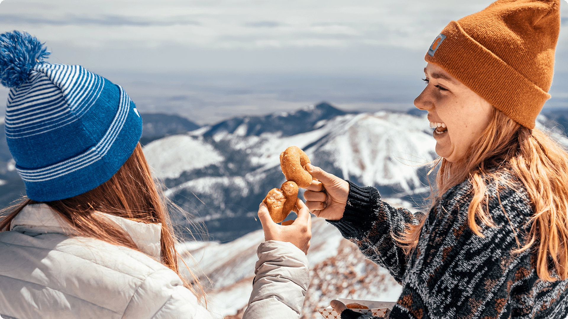
Pikes Peak Region Attractions

Transforming a fragmented network of 25+ regional attractions into a unified, editorial-style digital experience that drives tourism and simplifies content management.

Figma

Adobe Photoshop


The Challenge
The Pikes Peak region encompasses over 25 unique attractions across multiple communities—from Colorado Springs to Manitou Springs, Cripple Creek to Cañon City. Each attraction was independently run, creating a disjointed user experience with no cohesive visual identity or information architecture.
The original interface functioned more like an overwhelming cluttered database than a travel guide.
Key Problems
Content-heavy pages with no clear hierarchy made it difficult for visitors to discover experiences
Generic, outdated design with a pale color palette that didn't reflect the vibrancy of the region
No scalable system for future growth or easy content updates
Site needed full Spanish translation to serve broader audiences
Project Goals
Attract more visitors by creating an engaging digital gateway to the region
Enhance the visitor experience with personalized content and intuitive planning tools
Showcase each community's unique character while maintaining brand cohesion
Position Pikes Peak as a leader in innovative, collaborative tourism
My Role & Approach
As the solo designer, I was responsible for
Information Architecture: Restructuring content organization to create clear user paths and reduce cognitive load
Visual Design System: Establishing a modern, image-driven design language inspired by editorial platforms like Airbnb
Component Library: Building modular, scalable components to accommodate 25+ unique attractions while maintaining visual consistency
Localization: Translating and adapting the entire site to Spanish as a native speaker, ensuring cultural relevance
Visual Refinement & Grid Systems
Working from the provided Information Architecture, I used Figma to replace the original site's dense layout with a mobile-first, modular grid system. By prioritizing clean design and the strategic use of white space, I developed adaptable components that ensure a seamless responsive transition between mobile and desktop views. This approach, paired with a new typography hierarchy, creates a more breathable, intuitive experience that allows the content to lead the user journey.

Color Palette Modification
I modified the brand’s color system to better reflect the Pikes Peak region. I utilized a palette of grounded mirroring the natural textures of the local landscape. This creates a professional atmosphere while allowing the photography to remain the focal point.

Iconography Integration
I used a consistent set of monoline icons to make the site’s dense information easier to scan. By styling these symbols to match the new earth-tone palette, I replaced cluttered text with clear visual cues for amenities and logistics. This improved the overall organization of the page, keeping the layout clean and professional while ensuring the high-impact photography remained the main focus.

Art Direction & Asset Polishing
To achieve a premium, editorial feel, I was highly selective with the regional photography. Using Photoshop, I handled complex cutouts and specific image treatments to ensure every asset felt premium and cohesive with the new editorial tone.


Bilingual Experience
Beyond translation, I ensured the Spanish version maintained the same editorial quality and user experience, adapting content where necessary for cultural context.

Key Deliverables
Complete information architecture and site map
Full UI design system with 30+ reusable components
High-fidelity designs for 15+ core page templates
Spanish translation and localization across the entire site
Design documentation for developers and future content editors
The Solution
The final result is a complete visual overhaul that balances inspiration and utility. By moving to a clean, component-based system, I ensured that hundreds of pages of content—from blog articles to complex price lists—felt like a single, cohesive journey. The redesign successfully transitioned the site from an outdated, fragmented list of links into a world-class destination portal through professional polish, illustrative storytelling, and visual clarity.
Industry
Tourism & Hospitality
Roles & Services
Web / UI Design / QA
Pikes Peak Region Attractions
Transforming a fragmented network of 25+ regional attractions into a unified, editorial-style digital experience that drives tourism and simplifies content management.
Figma
Adobe Photoshop
The Challenge
The Pikes Peak region encompasses over 25 unique attractions across multiple communities—from Colorado Springs to Manitou Springs, Cripple Creek to Cañon City. Each attraction was independently run, creating a disjointed user experience with no cohesive visual identity or information architecture.
The original interface functioned more like an overwhelming cluttered database than a travel guide.
Key Problems
Content-heavy pages with no clear hierarchy made it difficult for visitors to discover experiences
Generic, outdated design with a pale color palette that didn't reflect the vibrancy of the region
No scalable system for future growth or easy content updates
Site needed full Spanish translation to serve broader audiences
Project Goals
Attract more visitors by creating an engaging digital gateway to the region
Enhance the visitor experience with personalized content and intuitive planning tools
Showcase each community's unique character while maintaining brand cohesion
Position Pikes Peak as a leader in innovative, collaborative tourism
My Role & Approach
As the solo designer, I was responsible for
Information Architecture: Restructuring content organization to create clear user paths and reduce cognitive load
Visual Design System: Establishing a modern, image-driven design language inspired by editorial platforms like Airbnb
Component Library: Building modular, scalable components to accommodate 25+ unique attractions while maintaining visual consistency
Localization: Translating and adapting the entire site to Spanish as a native speaker, ensuring cultural relevance
Visual Refinement & Grid Systems
Working from the provided Information Architecture, I used Figma to replace the original site's dense layout with a mobile-first, modular grid system. By prioritizing clean design and the strategic use of white space, I developed adaptable components that ensure a seamless responsive transition between mobile and desktop views. This approach, paired with a new typography hierarchy, creates a more breathable, intuitive experience that allows the content to lead the user journey.
Color Palette Modification
I modified the brand’s color system to better reflect the Pikes Peak region. I utilized a palette of grounded mirroring the natural textures of the local landscape. This creates a professional atmosphere while allowing the photography to remain the focal point.
Iconography Integration
I used a consistent set of monoline icons to make the site’s dense information easier to scan. By styling these symbols to match the new earth-tone palette, I replaced cluttered text with clear visual cues for amenities and logistics. This improved the overall organization of the page, keeping the layout clean and professional while ensuring the high-impact photography remained the main focus.
Art Direction & Asset Polishing
To achieve a premium, editorial feel, I was highly selective with the regional photography. Using Photoshop, I handled complex cutouts and specific image treatments to ensure every asset felt premium and cohesive with the new editorial tone.
Bilingual Experience
Beyond translation, I ensured the Spanish version maintained the same editorial quality and user experience, adapting content where necessary for cultural context.
Key Deliverables
Complete information architecture and site map
Full UI design system with 30+ reusable components
High-fidelity designs for 15+ core page templates
Spanish translation and localization across the entire site
Design documentation for developers and future content editors
The Solution
The final result is a complete visual overhaul that balances inspiration and utility. By moving to a clean, component-based system, I ensured that hundreds of pages of content—from blog articles to complex price lists—felt like a single, cohesive journey. The redesign successfully transitioned the site from an outdated, fragmented list of links into a world-class destination portal through professional polish, illustrative storytelling, and visual clarity.
Industry
Tourism & Hospitality
Roles & Services
Web / UI Design / QA
Pikes Peak Region Attractions
Transforming a fragmented network of 25+ regional attractions into a unified, editorial-style digital experience that drives tourism and simplifies content management.
Figma
Adobe Photoshop
The Challenge
The Pikes Peak region encompasses over 25 unique attractions across multiple communities. Each attraction was independently run, creating a disjointed user experience with no cohesive visual identity or information architecture.
The original interface functioned more like an overwhelming cluttered database than a travel guide.
Key Problems
Content-heavy pages with no clear hierarchy made it difficult for visitors to discover experiences
Generic, outdated design with a pale color palette that didn't reflect the vibrancy of the region
No scalable system for future growth or easy content updates
Project Goals
Attract more visitors by creating an engaging digital gateway to the region
Enhance the visitor experience with personalized content and intuitive planning tools
Showcase each community's unique character while maintaining brand cohesion
Position Pikes Peak as a leader in innovative, collaborative tourism
My Role & Approach
As the solo designer, I was responsible for
Restructuring content organization to create clear user paths and reduce cognitive load
Visual Design System: Establishing a modern, image-driven design language inspired by editorial platforms like Airbnb
Component Library: Building modular, scalable components to accommodate 25+ unique attractions while maintaining visual consistency
Localization: Translating and adapting the entire site to Spanish as a native speaker, ensuring cultural relevance
Visual Refinement & Grid Systems
Working from the provided Information Architecture, I used Figma to replace the original site's dense layout with a mobile-first, modular grid system. By prioritizing clean design and the strategic use of white space, I developed adaptable components that ensure a seamless responsive transition between mobile and desktop views. This approach, paired with a new typography hierarchy, creates a more breathable, intuitive experience that allows the content to lead the user journey.
Color Palette Modification
I modified the brand’s color system to better reflect the Pikes Peak region. I utilized a palette of grounded mirroring the natural textures of the local landscape. This creates a professional atmosphere while allowing the photography to remain the focal point.
Iconography Integration
I used a consistent set of monoline icons to make the site’s dense information easier to scan. By styling these symbols to match the new earth-tone palette, I replaced cluttered text with clear visual cues for amenities and logistics. This improved the overall organization of the page, keeping the layout clean and professional while ensuring the high-impact photography remained the main focus.
Art Direction & Asset Polishing
To achieve a premium, editorial feel, I was highly selective with the regional photography. Using Photoshop, I handled complex cutouts and specific image treatments to ensure every asset felt premium and cohesive with the new editorial tone.
Bilingual Experience
Beyond translation, I ensured the Spanish version maintained the same editorial quality and user experience, adapting content where necessary for cultural context.
Key Deliverables
Complete information architecture and site map
Full UI design system with 30+ reusable components
High-fidelity designs for 15+ core page templates
Spanish translation and localization across the entire site
Design documentation for developers and future content editors