Industry
Non-Profit / Education
Roles & Services
UI Design, Design Systems Architect / QA
STEM Next
Engineering a scalable, tokenized design system that transforms high-level creative vision into a cohesive national digital presence for STEM education.

Figma
The Challenge
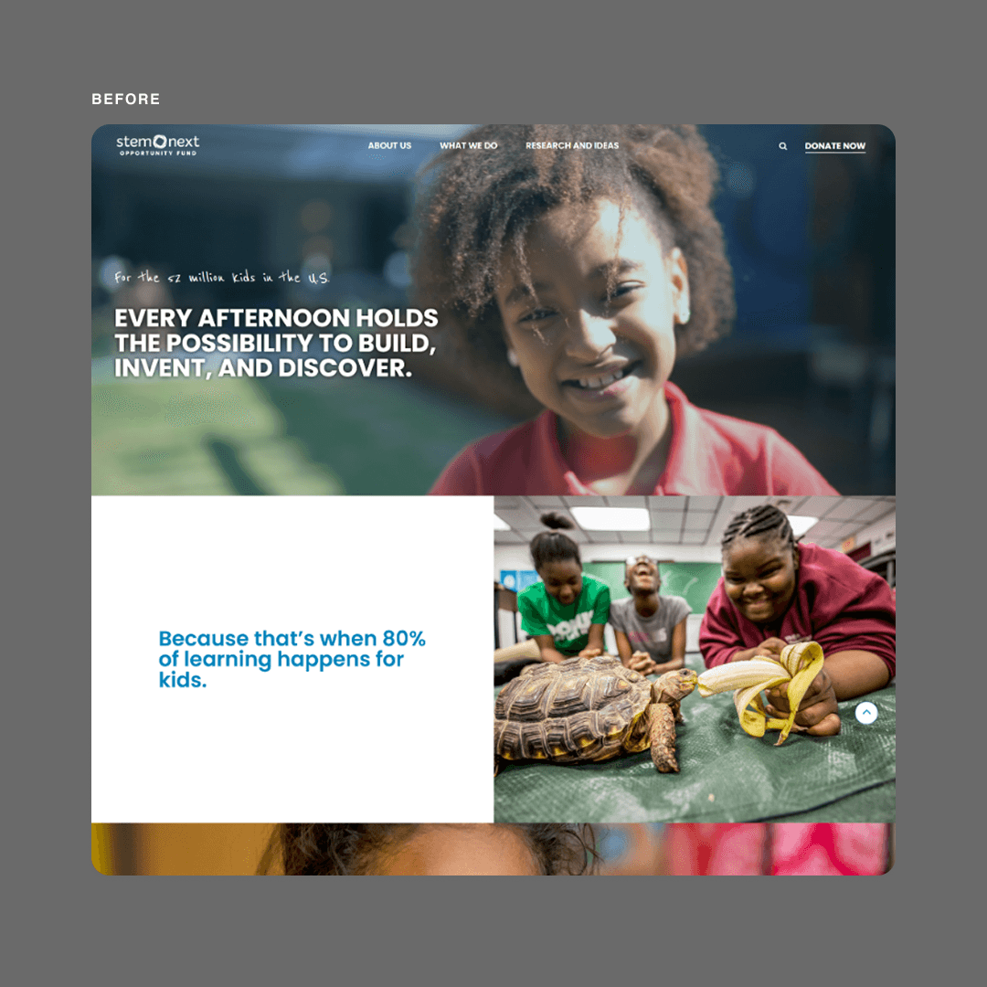
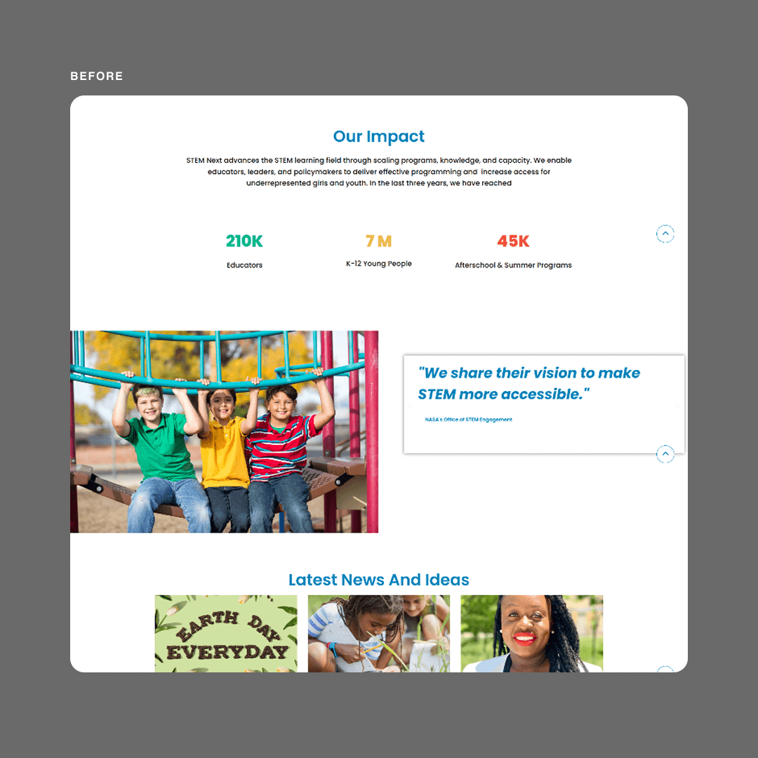
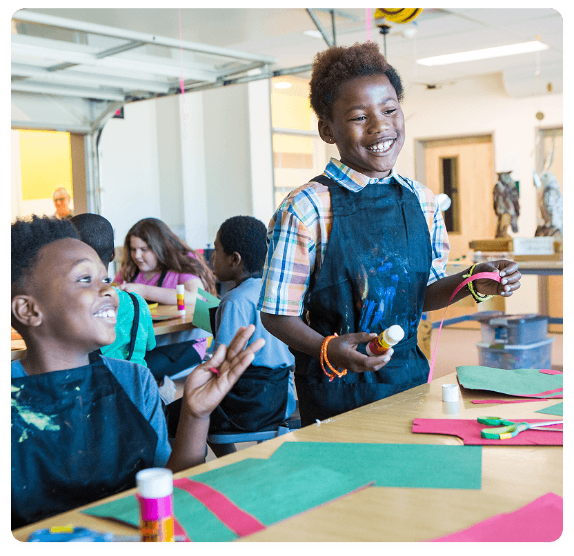
STEM Next needed to unite multiple audiences—from funders and policymakers to workforce leaders and program implementers—under a single, authoritative digital platform. The organization lacked visual consistency and struggled to communicate their leadership position in out-of-school-time (OST) STEM education.
Key Problems
Fragmented Brand Experience: Visual inconsistency across digital touchpoints undermined credibility and made it difficult to establish authority in the space
Multi-Audience Communication: The platform needed to simultaneously serve funders seeking ROI data, policymakers looking for scalable solutions, and program implementers needing practical resources—each with vastly different content needs
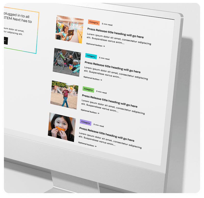
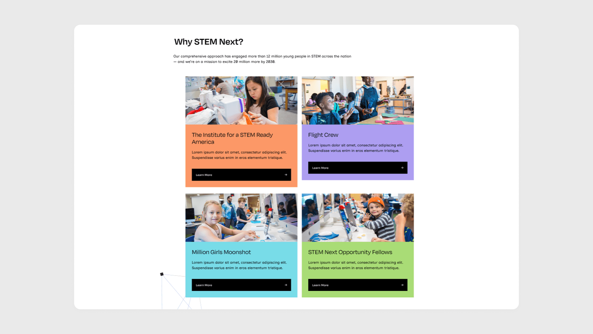
No Scalable Infrastructure: Without a component library or design system, every new page was built from scratch, leading to wasted time, inconsistency, and a disjointed user experience
Awareness Gap: Many stakeholders didn't understand STEM Next's role in the talent pipeline or recognize OST STEM as a workforce development solution
Designer Collaboration Barriers: Multiple designers needed to work on the platform without creating visual chaos, but there were no shared standards or systems to ensure cohesion
Project Goals
Elevate brand awareness as the leader in OST STEM
Improve communication across diverse stakeholder groups
Increase engagement through clear, compelling content
Ensure visual consistency across all digital touchpoints
Create a system that supports long-term brand management
My Role & Approach
My Personal Challenge
Building a component library sophisticated enough to maintain cohesion across a complex, multi-audience platform while remaining flexible enough for other designers to use and adapt.
Component Architecture & Design Tokens
I built and designed the entire component library based on the design style we agreed with the lead designer. To ensure maximum flexibility, I implemented Figma variables and tokens. This allowed for a fully customizable system where global styles could be updated instantly across the entire project. By building "smart" components with multiple properties and states, I provided the team with a toolkit that allowed for rapid iteration without breaking the design logic.
Color Palette Modification
Rather than creating static components, I engineered flexible building blocks using variables that let designers customize instances without breaking the system. Each component was built with multiple variants and states to handle diverse content needs.

Responsive Adaptation
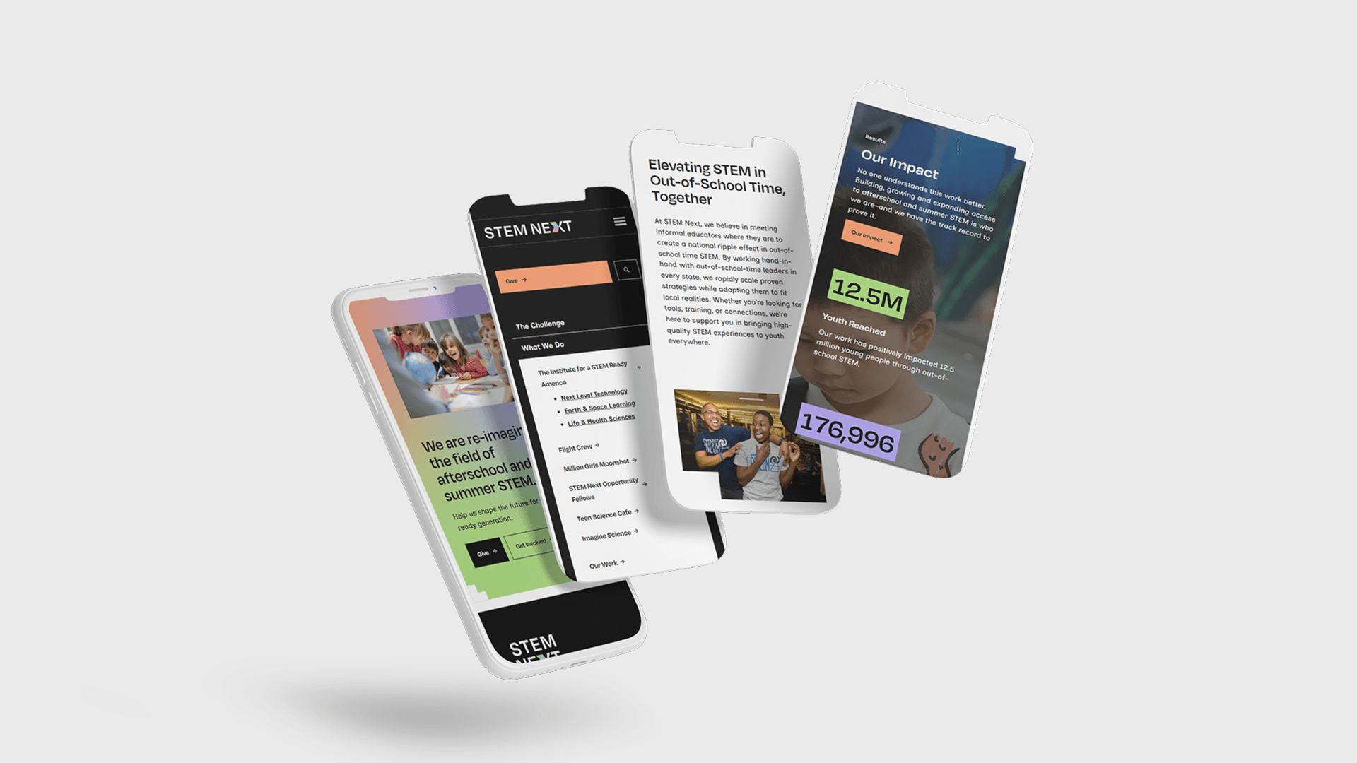
While along with the creative lead we established the desktop aesthetic, I was responsible for the mobile adaptations. This involved more than just shrinking elements; I redesigned the information architecture for smaller screens, ensuring that complex data and navigation remained intuitive and accessible for users on the go.

Scalability Through Structure
The system was designed for growth. New pages, sections, or features could be built quickly using existing components, ensuring the site could evolve without sacrificing cohesion.
Key Deliverables
Complete tokenized design system with 50+ components
Comprehensive component documentation and usage guidelines
Design handoff files for development team
Brand consistency guidelines for multi-designer collaboration
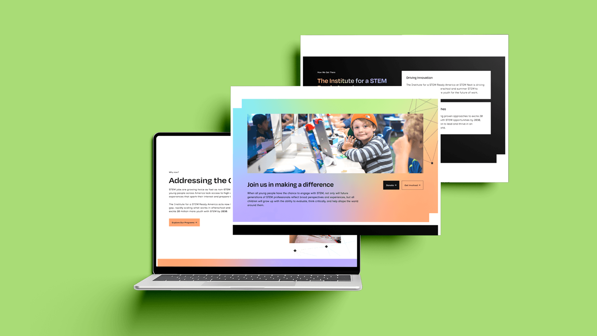
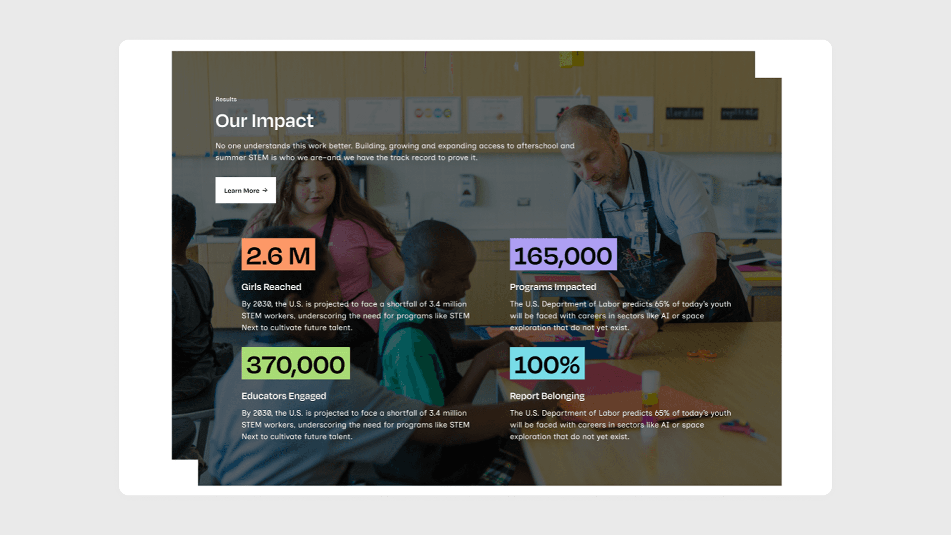
The Solution
Explore the tangible results of the Dazzle Company rebranding. Witness increased brand recognition, heightened engagement, and a positive impact on market perception. Dazzle Company now stands as a beacon in the tech industry, symbolizing not only advanced technology but also a commitment to elegance in every solution.
Industry
Non-Profit / Education
Roles & Services
UI Design, Design Systems Architect / QA
STEM Next
Engineering a scalable, tokenized design system that transforms high-level creative vision into a cohesive national digital presence for STEM education.
Figma
The Challenge
STEM Next needed to unite multiple audiences—from funders and policymakers to workforce leaders and program implementers—under a single, authoritative digital platform. The organization lacked visual consistency and struggled to communicate their leadership position in out-of-school-time (OST) STEM education.
Key Problems
Fragmented Brand Experience: Visual inconsistency across digital touchpoints undermined credibility and made it difficult to establish authority in the space
Multi-Audience Communication: The platform needed to simultaneously serve funders seeking ROI data, policymakers looking for scalable solutions, and program implementers needing practical resources—each with vastly different content needs
No Scalable Infrastructure: Without a component library or design system, every new page was built from scratch, leading to wasted time, inconsistency, and a disjointed user experience
Awareness Gap: Many stakeholders didn't understand STEM Next's role in the talent pipeline or recognize OST STEM as a workforce development solution
Designer Collaboration Barriers: Multiple designers needed to work on the platform without creating visual chaos, but there were no shared standards or systems to ensure cohesion
Project Goals
Elevate brand awareness as the leader in OST STEM
Improve communication across diverse stakeholder groups
Increase engagement through clear, compelling content
Ensure visual consistency across all digital touchpoints
Create a system that supports long-term brand management
My Role & Approach
My Personal Challenge
Building a component library sophisticated enough to maintain cohesion across a complex, multi-audience platform while remaining flexible enough for other designers to use and adapt.
Component Architecture & Design Tokens
I built and designed the entire component library based on the design style we agreed with the lead designer. To ensure maximum flexibility, I implemented Figma variables and tokens. This allowed for a fully customizable system where global styles could be updated instantly across the entire project. By building "smart" components with multiple properties and states, I provided the team with a toolkit that allowed for rapid iteration without breaking the design logic.
Component Library
Rather than creating static components, I engineered flexible building blocks using variables that let designers customize instances without breaking the system. Each component was built with multiple variants and states to handle diverse content needs.
Responsive Adaptation
While along with the creative lead we established the desktop aesthetic, I was responsible for the mobile adaptations. This involved more than just shrinking elements; I redesigned the information architecture for smaller screens, ensuring that complex data and navigation remained intuitive and accessible for users on the go.
Scalability Through Structure
The system was designed for growth. New pages, sections, or features could be built quickly using existing components, ensuring the site could evolve without sacrificing cohesion.
Key Deliverables
Complete tokenized design system with 50+ components
Comprehensive component documentation and usage guidelines
Design handoff files for development team
Brand consistency guidelines for multi-designer collaboration
The Solution
Explore the tangible results of the Dazzle Company rebranding. Witness increased brand recognition, heightened engagement, and a positive impact on market perception. Dazzle Company now stands as a beacon in the tech industry, symbolizing not only advanced technology but also a commitment to elegance in every solution.
Industry
Non-Profit / Education
Roles & Services
UI Design, Design Systems Architect / QA
STEM Next
Engineering a scalable, tokenized design system that transforms high-level creative vision into a cohesive national digital presence for STEM education.
Figma
The Challenge
STEM Next needed to unite multiple audiences under a single, authoritative digital platform. The organization lacked visual consistency and struggled to communicate their leadership position in out-of-school-time (OST) STEM education.
Key Problems:
Fragmented Brand Experience: Visual inconsistency across digital touchpoints undermined credibility and made it difficult to establish authority in the space
Multi-Audience Communication: The platform needed to simultaneously serve funders seeking ROI data, policymakers looking for scalable solutions, and program implementers needing practical resources, each with vastly different content needs
No Scalable Infrastructure: Without a component library or design system, every new page was built from scratch, leading to wasted time, inconsistency, and a disjointed user experience
Awareness Gap: Many stakeholders didn't understand STEM Next's role in the talent pipeline or recognize OST STEM as a workforce development solution
Designer Collaboration Barriers: Multiple designers needed to work on the platform without creating visual chaos, but there were no shared standards or systems to ensure cohesion
Project Goals:
Elevate brand awareness as the leader in OST STEM
Improve communication across diverse stakeholder groups
Increase engagement through clear, compelling content
Ensure visual consistency across all digital touchpoints
Create a system that supports long-term brand management
My Role & Approach
My Personal Challenge
Building a component library sophisticated enough to maintain cohesion across a complex, multi-audience platform while remaining flexible enough for other designers to use and adapt.
Component Architecture & Design Tokens
I built and designed the entire component library based on the design style we agreed with the lead designer. To ensure maximum flexibility, I implemented Figma variables and tokens. This allowed for a fully customizable system where global styles could be updated instantly across the entire project.
Component Library
Rather than creating static components, I engineered flexible building blocks using variables that let designers customize instances without breaking the system. Each component was built with multiple variants and states to handle diverse content needs.
Responsive Adaptation
While along with the creative lead we established the desktop aesthetic, I was responsible for the mobile adaptations. This involved more than just shrinking elements; I redesigned the information architecture for smaller screens, ensuring that complex data and navigation remained intuitive and accessible for users on the go.
Scalability Through Structure
The system was designed for growth. New pages, sections, or features could be built quickly using existing components, ensuring the site could evolve without sacrificing cohesion.
Key Deliverables
Complete tokenized design system with 50+ components
Comprehensive component documentation and usage guidelines
Design handoff files for development team
Brand consistency guidelines for multi-designer collaboration